Class 6 · Unit 2: Data · Lesson 2.3 · 40 min
Pictures of data: bar charts and pictograms
Walk 14, Bus 9, Car 3, Bicycle 2, Sumo 4. Which is the most? Draw five bars — and everyone can see it at once.
Today you will: Turn a table into a bar chart · Watch the chart change by itself · Read a pictogram with a key
Story
Ms. Rafiqa asks her class, "How do you come to school?" She writes on the board: Walk 14, Bus 9, Car 3, Bicycle 2, Sumo 4.
Aamir squints. "Which is the most? I have to read every number."
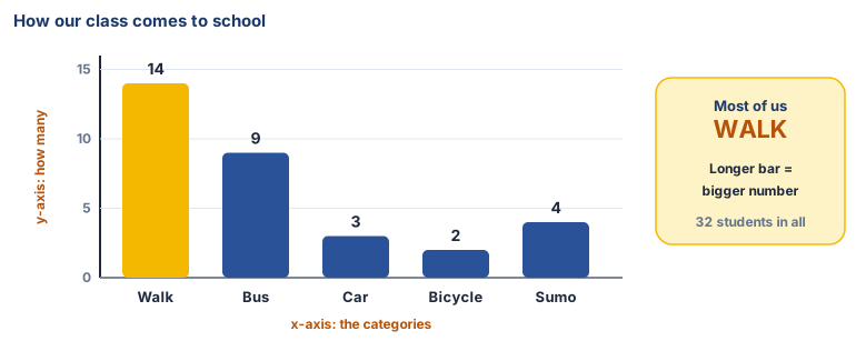
Ms. Rafiqa draws five bars on the board, one for each way of coming to school. The class can see the answer immediately: most of us walk.
Teacher: “A chart, is data you can see at a glance.”
Watch
Making data into pictures — — scan code 6.2.3 in the printed book.
Warm up your fingers
10 minutes on typing.com: top row and home row mixed.
- Review lessons mixing the home row and top row.
- Try one timed test at your own pace. Write your speed and accuracy in your notebook (your own record only, not for comparing with anyone).
On the laptop
Tools: LibreOffice Calc
Mission 1: Build a bar chart (pairs, 10 min)
- ☐1
New Calc sheet. Type the table in A1 to B6:
How we come to school · Students, then Walk 14 · Bus 9 · Car 3 · Bicycle 2 · Sumo 4 — or your own class's numbers from a show of hands. - ☐2
Predict: which bar will be the tallest? Which the shortest?
- ☐3
Drag to select A1 to B6. Insert → Chart → Column → Next.
- ☐4
Title it
How our class comes to schooland click Finish. Were you right?
Mission 2: Change it, try another (pairs, 7 min)
- ☐5
Click outside the chart and change Bus from 9 to 12. Watch the chart change by itself.
- ☐6
Select the data again and try a Pie chart. Which makes the answer easiest to see?
- ☐7
Save as
travel.odsinmy-data-6.
No laptop today?
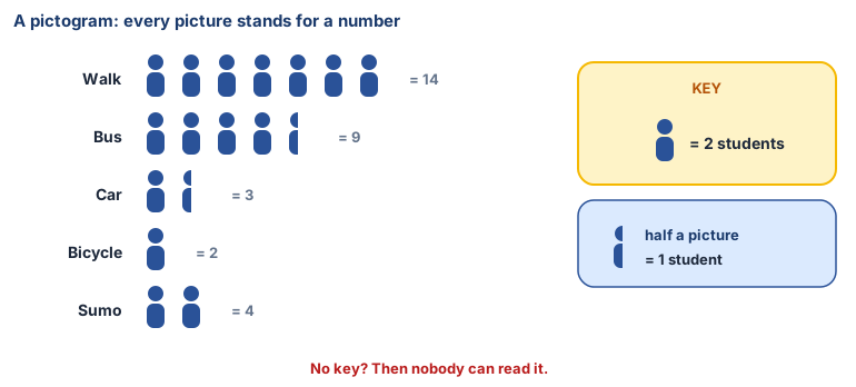
Make a pictogram on squared paper. Choose a key — one stick figure = 2 students — and draw each way of travelling. For an odd number, draw half a figure. Swap with a partner: can they read your numbers back?
Now you know
- A chart shows data as a picture, so patterns jump out.
- In a bar chart a longer bar means a bigger number. It needs labels and a title.
- The x-axis runs along the bottom and holds the categories — walk, bus, car.
- The y-axis runs up the side and holds the values — how many students.
- In a pictogram each picture stands for a number, and the key says how many. No key, no reading it.
- A spreadsheet chart updates itself when the data changes.
- Choose the chart that makes the answer easiest to see.
Debate it
Someone makes a bar chart where the "Car" bar is drawn twice as tall as it should be. Why might someone do that? How could you catch it?
Check yourself — practice, not a test
1. In a bar chart, the longest bar shows:
- ○ The smallest number
- ○ The biggest number
- ○ The first item typed
- ○ The title
2. In a pictogram, the ______ tells you how many each picture stands for.
3. If you change a number in the table, a Calc chart made from it changes too.
- ○ True
- ○ False
4. A good bar chart has (choose all that apply):
- ○ A title
- ○ Labels on the bars
- ○ As many colours as possible
- ○ Bars that match the numbers
5. In a bar chart of how students travel to school, the x-axis holds:
- ○ The number of students
- ○ The ways of travelling: walk, bus, car
- ○ The title
- ○ The key
Remember
A chart is data you can see at a glance, but only if it's honest and labelled.