Class 6 · Unit 3: Patterns and decisions · Lesson 3.2 · 40 min
Patterns in data — Srinagar's weather
Grandfather says the Dal once froze so hard he walked on it. Which month is really the coldest? Let the numbers draw you a picture.
Today you will: Type a year of Srinagar's weather · Turn 12 numbers into a line chart · Spot the hill — and the months below zero
Story
Grandfather: “When I was a boy, Chillai Kalan was so cold that the Dal Lake froze and we walked on it.”
Bilal: “Which is the coldest month, really? And which is the hottest?”
Grandfather smiles. "Let the numbers tell you."
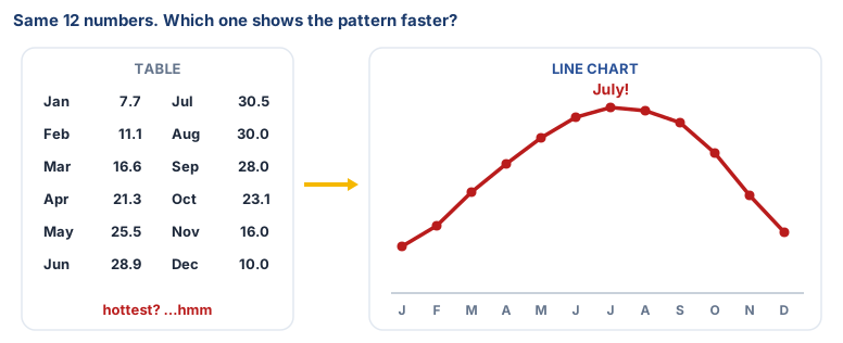
Numbers in a table are hard to read. A picture of the numbers, a chart, shows the pattern at once.
Watch
Turning numbers into a picture — — scan code 6.3.2 in the printed book.
Warm up your fingers
Today you will type many numbers.
- On typing.com: Beginner → Numbers / number row lessons. If your class is not ready for the number row, stay on home-row practice.
- Also practise the minus sign (−), which we need for cold months.
- Goal: look at the screen, not your fingers.
On the laptop
Tools: LibreOffice Calc (offline, no account)
Mission 1: Type the data (alone or pairs, 8 min)
- ☐1
Open a new Calc file. Save it as
srinagar-weather.ods. - ☐2
Row 1 headings:
Month·Low (°C)·High (°C). PutJantoDecin column A — use the drag-to-fill trick. - ☐3
Type the averages for Srinagar, 1991–2020:
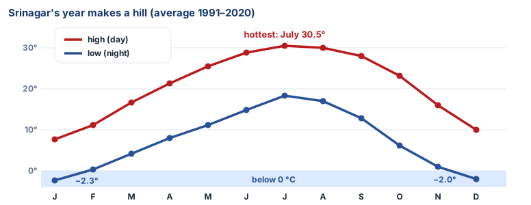
Month Low (°C) High (°C) Jan −2.3 7.7 Feb 0.4 11.1 Mar 4.1 16.6 Apr 8.0 21.3 May 11.1 25.5 Jun 14.9 28.9 Jul 18.3 30.5 Aug 17.0 30.0 Sep 12.8 28.0 Oct 6.1 23.1 Nov 1.0 16.0 Dec −2.0 10.0
Mission 2: Draw the picture (alone or pairs, 10 min)
- ☐4
Predict: which month will be hottest? Write your guess before you make the chart.
- ☐5
Select everything from
Monthto December's High. Insert → Chart… → Line → Points and Lines → Finish. - ☐6
Answer in your file: the coldest and hottest months · the shape of the line in one sentence (a hill? a valley?) · the months where the low is below zero.
Finished early?
In D1 type Difference, in D2 type =C2-B2, and drag it down. Which month has the
biggest gap between day and night?
No laptop today?
Draw the chart on squared paper: months along the bottom, temperature up the side. Plot a dot for each month and join the dots.
Now you know
- A table is correct, but its pattern is hard to see.
- Data visualisation turns data into a picture. A line chart shows how something changes over time.
- A time series is data collected over time, like one reading each month. Studying it for seasons and trends is time-series analysis.
- Srinagar's year is a hill: cold in winter, warmest in July, cold again.
- The pattern repeats every year so we can make good guesses about next year. That's how weather AI learns too.
🕌 From our heritage
Look up at the wooden ceiling of an old Kashmiri mosque or shrine. That craft is called khatamband: hundreds of small wooden pieces slotted together, with no glue and almost no nails, into a repeating geometric pattern. The craftsman works from a rule — a shape that turns, repeats and fits — exactly as you look for the rule behind data. The craft came to Kashmir in the fourteenth century with Mir Sayyid Ali Hamadani, and the shrine named after him in Srinagar holds some of the finest work.
Khatamband ceilings, Khanqah-e-Moula (Shah-i-Hamadan), Srinagar.
Debate it
These are averages over 30 years. Grandfather remembers the lake freezing.
Can an average tell you what one particular day will be like? What might an average hide?
Check yourself — practice, not a test
1. Which chart is best for showing how temperature changes month by month?
- ○ Pie chart
- ○ Line chart
- ○ A table with no chart
- ○ A photograph
2. According to the data, which is Srinagar's warmest month?
- ○ May
- ○ July
- ○ September
- ○ December
3. In Srinagar, the average low temperature in January is below zero.
- ○ True
- ○ False
4. Put the steps for making a chart in order:
- 1. Choose the chart type and finish
- 2. Type the data into the spreadsheet
- 3. Select the data
- 4. Click Insert → Chart
5. Data collected over time, such as one temperature reading each month, is called a ______ ______.
Remember
A chart turns numbers into a picture, so the pattern jumps out.