Class 6 · Unit 4: Ethics and digital responsibility · Lesson 4.5 · 40 min
Human-centred design — who is it for?
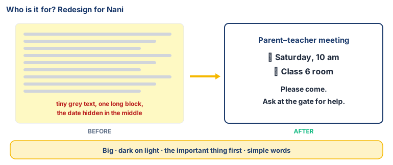
The school notice arrives as tiny grey letters on pale yellow. Nani holds it close, then far, then gives up. Did anyone who made it think of her?
Today you will: Try zoom, magnifier and a screen reader · Redesign a notice for one real person · Ask: who is it for — and who's left out?
Story
Hiba's grandmother, Nani, wants to read the school's notice about the parent–teacher meeting. It arrives on the phone as a picture: small grey letters on a pale yellow background, all in one long block.
Nani holds the phone close, then far away, then gives it back. "I can't read this, jigar. When is the meeting?"
Hiba reads it out loud. Then she wonders: who made this notice, and did they ever think about Nani?
Today you will learn that good technology starts with one question: who is it for?
Watch
Design for a real person — — scan code 6.4.5 in the printed book.
Warm up your fingers
Skill: bottom row, N and V (7 min)
- On typing.com, open Beginner → "Bottom Row: N and V".
- Reach down from F to V, and from J to N, then back home.
- Before you start, press Ctrl and + to zoom the lesson in. Is it easier to read? You are already using an accessibility setting.
On the laptop
Tools: the laptop's accessibility settings · LibreOffice Writer · PTM notice.odt (your teacher
shares it)
Mission 1: Try the tools (pairs, 8 min)
One partner reads each step aloud; the other does it.
- ☐1
Zoom: Ctrl + bigger, Ctrl – smaller, Ctrl 0 reset.
- ☐2
Magnifier: Windows key + on; Windows key + Esc off.
- ☐3
High contrast: Settings → Accessibility → Contrast themes — try one, then set it back.
- ☐4
Screen reader: Ctrl + Windows key + Enter starts Narrator; the same keys stop it . Volume low, take turns.
- ☐5
Write down: which tool would help Nani? Which would help someone who can't see at all?
Mission 2: Redesign the notice (alone, 8 min)
- ☐6
Open
PTM notice.odt. Choose one real person to design for — a grandparent, a younger child, a classmate with glasses. - ☐7
Predict: which change will help your person most?
- ☐8
Redesign it: text size 16+, dark on light, date, time and place first in bold, short lines, simple words.
- ☐9
Let Narrator read it aloud. Does it still make sense when you only hear it?
- ☐10
At the bottom: "I designed this for ___ because ___."
No laptop today?
Rewrite the notice by hand twice — "before" (tiny, crowded) and "after" (big, clear, date first). Read the "after" aloud to a partner with their eyes closed. Could they follow it?
Now you know
- Human-centred design starts with the people who will use something — their needs, their difficulties, what they already know.
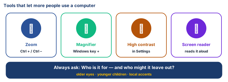
- Accessibility settings zoom, magnifier, high contrast, screen readers — let more people use a computer.
- Good design: big clear text, dark on light, the important thing first, simple words.
- AI can help read-aloud, voice typing — but only if it learned from all kinds of people, including older voices and local accents.
- Always ask: who is it for, and who might it leave out?
🕌 From our heritage
Our jurists had a word for judging something by whether it genuinely benefits people: maṣlaḥah. Al-Ghazālī (d. 1111 CE), in al-Mustaṣfā, argued that a ruling serves the common good only when it protects what people really need, and al-Shāṭibī (d. 1388 CE) built his al-Muwāfaqāt around the purposes behind a rule rather than its surface. Designers ask the same question in a smaller way. When you redesigned Nani's notice, you stopped asking "does it look nice?" and started asking "does it actually help her?"
Sources: al-Ghazālī, al-Mustaṣfā fī ʿIlm al-Uṣūl; al-Shāṭibī, al-Muwāfaqāt fī Uṣūl al-Sharīʿah.
Debate it
A company makes a voice assistant that works perfectly in English but understands almost no Kashmiri.
Who is left out? Whose job is it to fix this: the company's, the government's, or ours?
Check yourself — practice, not a test
1. What does "human-centred design" mean?
- ○ Making technology look modern
- ○ Starting with the needs of the people who will use it
- ○ Using as many colours as possible
- ○ Letting AI design everything
2. Match each tool to what it does:
Zoom / Magnifier · High contrast · Screen reader
Match with: Makes text stand out from the background · Makes things bigger on screen · Reads the screen aloud3. Which changes make a notice easier for Nani to read? (choose all that apply)
- ○ Bigger text
- ○ Grey text on yellow
- ○ Date and time at the top in bold
- ○ Short lines instead of one long block
4. A voice AI trained only on young people's voices will work equally well for everyone.
- ○ True
- ○ False
Remember
Ask who it is for, and who it leaves out. If it doesn't work for Nani, it isn't finished.