Class 7 · Unit 4: Data visualisation · Lesson 4.4 · 40 min
Bar, line and pie charts
Same numbers, two charts. Bilal's pie looks like a broken wheel. Hiba's line climbs, peaks in summer and rises again for Gulmarg snow. Different chart, different story.
Today you will: Make a line, a bar and a pie chart · Match each chart to the question it answers · Read a chart like an analyst
Story
The Tourism Office asks Class 7 to make one chart for a poster at the Srinagar airport.
- Bilal makes a pie chart of visitors by month. Twelve thin slices look like a broken wheel, and nobody can see which month is busiest.
- Hiba makes a line graph of the same data. It climbs in spring, peaks in summer, dips, and rises again for snow in Gulmarg.
Teacher: “Same numbers. Different chart, different story.”
Watch
Choosing the right chart — — scan code 7.4.4 in the printed book.
Warm up your fingers
8 minutes on typing.com: sentences.
- Term 2 sentence lessons.
- Custom lesson words: visualisation, bar chart, line graph, pie chart, trend, legend, axis, title.
- Try the whole minute without looking at the keys.
On the laptop
You need: LibreOffice Calc · unit-4/visitors.ods (Visitors by month and Where visitors went — invented for practice, never for a real poster)
Mission 1: Three charts (pairs, 10 min)
- ☐1
Predict: which chart will show when visitors come best — line, bar or pie?
- ☐2
Line: select Visitors by month with headings, Insert → Chart → Line → Points and Lines. In Chart Elements, title it
Visitors to Kashmir by month (practice data), X axisMonth, Y axisVisitors (thousands). - ☐3
Bar: the same table, Insert → Chart → Column, with a title and labels.
- ☐4
Pie: Where visitors went, Insert → Chart → Pie, tick Show legend.
Mission 2: Wrong on purpose, then read it (pairs, 8 min)
- ☐5
Make a pie of Visitors by month. Look at the 12 slices.
- ☐6
Answer under your charts: which shows when best? which shows which place most? why is the 12-slice pie hard to read?
- ☐7
On the line graph, find the busiest and quietest months: "Visitors rise from ___ to ___ and fall in ___." Save as
charts-7.ods.
Finished early?
Open rain-log-clean.ods from 4.3 and make a line graph of rain and snow by date. Leave the
missing days as gaps — don't pretend they were zero.
No laptop today?
Your teacher writes both tables on the board. Groups draw one chart each on chart paper — line, bar, pie — then the class votes on which chart answers which question best, with reasons.
Now you know
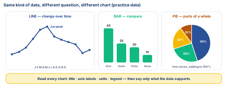
- Data visualisation turns data into charts, graphs or maps so patterns are easy to see.
- Bar chart: compares categories — highest and lowest at a glance.
- Line graph: change over time — best for trends.
- Pie chart: parts of a whole — only a few slices, adding to 100%.
- Read every chart: title, axis labels, units, legend. Then say only what the data supports.
Debate it
A chart shows that more visitors came in June than in January. One student concludes: "Tourists like summer better." Another says: "Maybe roads were closed by snow in January." What extra data would help you decide who is right?
Check yourself — practice, not a test
1. Match each question to the best chart:
How did Srinagar's temperature change over the year? · Which class collected the most plastic on Clean-Up Day? · What share of our class walks, takes the bus, or comes by car?
Match with: Bar chart · Pie chart · Line graph2. Which is not something to check when reading a chart?
- ○ The title
- ○ The axis labels and units
- ○ The legend
- ○ The colour of the laptop
3. A pie chart is a good choice for 12 months of data. (too many thin slices; months are change over time, so use a line graph)
- ○ True
- ○ False
4. A ______ shows how data changes over time.
Remember
Bar to compare, line for change over time, pie for parts of a whole. Always read the title, labels and units.