Class 7 · Unit 4: Data visualisation · Lesson 4.5 · 40 min
Accuracy, precision, and charts that lie
The new scale says 18.245 kg, 18.247 kg — so exact! Hiba puts a 5 kg bag of rice on it: 5.812 kg. Exact, and wrong.
Today you will: Tell precise from accurate · Make a chart lie — then fix it · Know what makes data valid
Story
At the Sopore mandi, Bilal's uncle buys a new digital scale. It shows every box of apples to three decimal places: 18.245 kg, 18.247 kg, 18.244 kg.
Uncle: “Very exact!”
Hiba puts a 5 kg bag of rice from home on the scale. It says 5.812 kg.
Hiba: “Exact, but wrong. Every box you sold today was weighed heavy.”
Watch
Accuracy, precision and misleading charts — — scan code 7.4.5 in the printed book.
Warm up your fingers
8 minutes on typing.com: accuracy focus.
- Term 2 sentence lessons.
- Today, accuracy beats speed. Aim for 95%, even if you type slower. A precise typist who is often wrong is not a good typist. That is today's lesson.
On the laptop
You need: LibreOffice Calc · unit-4/two-scales.ods · unit-4/attendance.ods (both invented for practice)
Mission 1: Two scales (pairs, 10 min)
- ☐1
Open
two-scales.ods: the same 5 bags of rice, each truly 5 kg, on Scale A and Scale B. - ☐2
Predict: which scale would you trust to sell apples? Note it.
- ☐3
In D2 type
=B2-5and fill down; in E2,=C2-5. That's how far each scale is from the truth. - ☐4
Which is more precise (readings close together)? Which is more accurate (close to 5 kg)?
- ☐5
Click C2 and press Add Decimal Place 4 times. Does
5.10000make the scale any better?
Mission 2: Make a chart lie, then fix it (pairs, 10 min)
- ☐6
Open
attendance.odsand make a column chart with a title and labels. - ☐7
Double-click the chart, then the Y axis → Format Axis → Scale. Untick Automatic for Minimum and type
90. Week 3 looks like a disaster. - ☐8
Type the real difference between the highest and lowest week. Set the minimum back to
0. - ☐9
"Starting the axis at 90 made the chart look ____, but the real change was only ____." Save as
honest-charts.ods.
No laptop today?
Draw the attendance bars twice on graph paper — axis from 0, and from 90. Which would a newspaper use to scare people? For Part 1, the teacher weighs a known 1 kg bag on the school scale: accurate, precise, both or neither?
Now you know
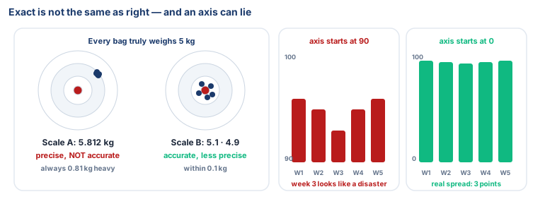
- Precision is how exact or detailed a measurement is.
- Accuracy is how close it is to the true value. A scale can be precise and still wrong.
- Valid data is accurate and precise enough to answer your question — only then can you trust the conclusion.
- Extra digits don't add precision.
25.000000is no more exact than25. - Check the axis. One that doesn't start at 0 can make a small change look huge.
Debate it
A news post shares a chart: "Crime in our town has EXPLODED!" The axis starts just below the lowest bar. What would you check before you believe it, or share it? Remember Stop – Check – Share from Class 6.
Check yourself — practice, not a test
1. A thermometer always shows 21.46 °C, but the room is really 25 °C. The thermometer is:
- ○ Accurate but not precise
- ○ Precise but not accurate
- ○ Both accurate and precise
- ○ Neither, because it has decimals
2. ______ is how close a measurement is to the true value.
3. Showing 25 as 25.000000 makes the data more precise.
- ○ True
- ○ False
4. A chart of attendance (95%, 96%, 94%) has its axis starting at 93. What is the danger?
- ○ The bars are too wide
- ○ Small differences look much bigger than they are
- ○ The chart has no legend
- ○ Attendance cannot be charted
5. A good data analyst… (choose all)
- ○ observes carefully
- ○ looks for patterns
- ○ picks the chart that looks most dramatic
- ○ draws conclusions the data can support
Remember
Precise means exact. Accurate means right. Always check where the axis starts.