Class 7 · Year project
Predict it
Hide part of your data. Learn the pattern from the rest. Predict what you hid — then find out exactly how far off you were, and why.
The big idea
All year you have seen AI predict: the next word, the weather, which leaf is diseased. Every prediction works the same way. Learn a pattern from old data, then use it on new data.
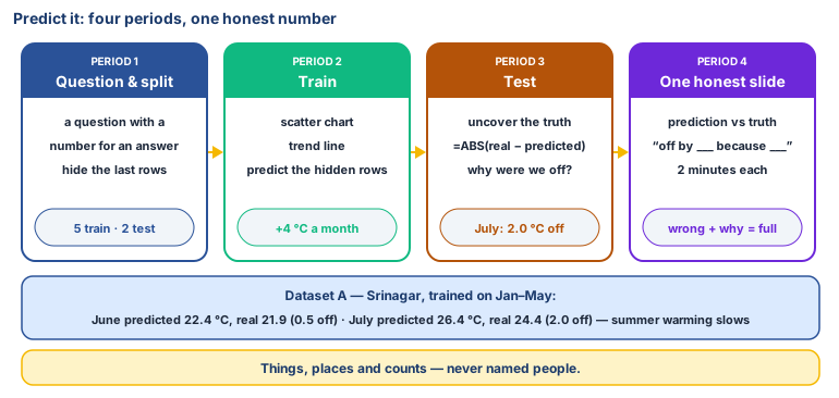
In this project you build the predictor. You will hide some of your data, learn a pattern from the rest, predict the hidden part, and then check how far off you were. That is exactly how AI engineers test a model before anyone is allowed to trust it.
📱 Scan to watch: How to test a prediction.
The golden rule: no personal data
As in Class 6, your data must be about things, places and counts, never about named people.
| ✅ Allowed | ❌ Not allowed |
|---|---|
| Average attendance of the whole class each week | Which students were absent |
| Temperature in the playground at 10 am each day | Photos of students |
| Number of vehicles passing the school gate in 10 minutes | Number plates |
| Published figures (IMD weather, horticulture reports) | Anyone's marks, health, family or address |
If you are not sure, ask your teacher before collecting.
Period 1: A question, the data, and the split
- In your group (3–4 students), choose a question with a number for an answer:
- If there are more snow days in a week, how low will attendance go? (Dataset B)
- How warm will Srinagar be in June and July? (Dataset A)
- Does more spring rain mean more apples per tree? (Dataset C)
- Or your own question, for example: does the classroom get warmer each hour of the morning? If you choose your own, collect at least 10 pairs of numbers over the next week.
- Name your two columns:
- Input (x): the thing you already know, e.g. snow days.
- Output (y): the thing you want to predict, e.g. attendance.
- Open LibreOffice Calc and save the file as
predict-it.odsin your group's folder. Type the data into columns A (x) and B (y), with headings in row 1. - Split the data. Add column C called
Part. Mark the first rows astrainingand the last 2 rows astest. From now on, you are not allowed to look at the test answers until Period 3. Your teacher may ask you to cover them with a sticky note on the screen, or to move them to a second sheet. - Write your guess in cell E1: "We think that when x goes up, y will…"
Keyboard warm-up: type all your numbers carefully, then swap with another group and check each other's typing against the source. One typo becomes a wrong prediction.
Period 2: Learn the pattern (train)
- Select only the training rows of columns A and B.
- Insert → Chart → XY (Scatter), and choose Points only. Give the chart a title and label both axes.
- Add a trendline: double-click the chart, right-click on a point, choose Insert Trend Line → Linear, and tick Show equation.
- Look at the line. In one sentence each:
- Does the line go up, go down, or stay flat?
- Are the points close to the line or scattered far from it?
- Now predict the test rows without looking at their answers. In column D (
Prediction), next to each test row, type:=FORECAST(A10; B$2:B$9; A$2:A$9)and change the numbers to match your rows. (Use,instead of;if Calc shows an error.) - Save.
Period 3: Test it (evaluate)
- Now uncover the real answers in the test rows.
- In column E (
How far off), type=ABS(B10-D10)for each test row.ABSremoves the minus sign, so this is simply the distance between the prediction and the truth. - Discuss, and answer in your file:
- How far off were we? Give the numbers, with units.
- Is that good enough? Being 2 °C off is fine for choosing a jacket, but would it be fine for a doctor or a pilot? It depends on what the prediction is used for.
- Why were we off? Too little data? Something the numbers didn't include (rain, a holiday, a festival)? A pattern that isn't a straight line?
- Pattern or cause? Does x really cause y, or do they only move together?
- Challenge: swap which rows are
testand repeat. Does your error change? (Engineers call this checking whether the result was luck.)
Period 4: Present one honest slide
- Open LibreOffice Impress and make one slide with:
- your question (the title)
- the scatter chart with its trendline (copy it from Calc and paste it in)
- our prediction vs. the truth: two numbers side by side
- one sentence: "Our predictor was off by ___ because ___."
- one sentence: "Someone could use this to ___, but they should be careful about ___."
- Each group presents for 2 minutes. Every member speaks at least once.
- The class asks each group one question.
Being wrong is a result, not a failure. A group that was far off, and can explain why, has done the project as well as a group that was close.
No laptop today?
Plot the training points on graph paper. Lay a thread or ruler across them so that it passes as close to as many points as possible, and draw the line. Read the prediction for each test x off your line, then compare it with the real answer and work out the difference. Present the graph as a poster. The rubric is the same.
Ready-made datasets
Copies are in Class-7/datasets/. Every dataset says where it comes from. Illustrative means
the numbers were made up for teaching, so that the pattern is clear. They are realistic, but they are not real records.
Dataset A: Srinagar's average temperature (sourced)
Monthly mean temperature, 1991–2020 averages. Source: climatestotravel.com, based on 1991–2020 normals.
| Month number (x) | Month | Mean temperature °C (y) | Part |
|---|---|---|---|
| 1 | January | 2.7 | training |
| 2 | February | 5.8 | training |
| 3 | March | 10.4 | training |
| 4 | April | 14.6 | training |
| 5 | May | 18.3 | training |
| 6 | June | 21.9 | test |
| 7 | July | 24.4 | test |
What happens: the line rises by 4 °C a month. It predicts June at 22.4 °C (0.5 off) and overshoots July at 26.4 °C (2.0 off), because warming slows down in summer. The pattern is not a straight line forever. For a second test, predict December (month 12) from the same line and see what goes wrong.
Dataset B: Snow days and attendance (illustrative)
One class, 10 winter weeks. Made up for teaching.
| Week | Snow days that week (x) | Average attendance % (y) | Part |
|---|---|---|---|
| 1 | 0 | 94 | training |
| 2 | 1 | 91 | training |
| 3 | 0 | 95 | training |
| 4 | 2 | 86 | training |
| 5 | 3 | 80 | training |
| 6 | 1 | 90 | training |
| 7 | 4 | 74 | training |
| 8 | 2 | 85 | training |
| 9 | 3 | 79 | test |
| 10 | 5 | 70 | test |
What happens: the line goes down, by about 5 percentage points for each snow day, and the test predictions land within about 1 point. This is a tidy pattern. Ask the class: would it still work in a week when the road was closed for a reason other than snow?
Dataset C: Spring rain and apples per tree (illustrative)
Ten orchards, one season. Made up for teaching.
| Orchard | Spring rainfall mm (x) | Apples per tree kg (y) | Part |
|---|---|---|---|
| 1 | 120 | 28 | training |
| 2 | 180 | 35 | training |
| 3 | 90 | 24 | training |
| 4 | 210 | 36 | training |
| 5 | 150 | 33 | training |
| 6 | 100 | 22 | training |
| 7 | 240 | 34 | training |
| 8 | 160 | 30 | training |
| 9 | 130 | 29 | test |
| 10 | 200 | 37 | test |
What happens: the points are scattered. The line goes up, but the predictions are a few kg off, and orchard 7 (the most rain) is below the line. Discussion: apples need water, but a very wet spring also spreads apple scab (Class 7 Unit 3). Other things matter too: soil, variety, spraying and the age of the tree. One input can't explain everything.
Rubric (for teacher and self-assessment)
Each group is described against the skill, never compared with other groups. There is no ranking, no "best group" and no leaderboard, and a big prediction error does not mean low marks.
Asking a prediction question
- Getting there:The question has no number for an answer
- Got it:Clear input (x) and output (y)
- Going further:Explains who could use the prediction, and for what
Data and privacy
- Getting there:Personal data collected, or data typed with errors
- Got it:No personal data; numbers checked against the source
- Going further:States the source, or says clearly that the data is illustrative
Splitting the data
- Getting there:Used all the data to draw the line
- Got it:Kept the test rows hidden until Period 3
- Going further:Explains why hiding test data matters
Trendline and prediction
- Getting there:The chart or trendline is missing
- Got it:Scatter chart with a trendline and FORECAST predictions
- Going further:Reads the trendline equation and explains what it means
Testing honestly
- Getting there:Did not compare with the real answers
- Got it:Calculated how far off each prediction was
- Going further:Tried a different split, or explained whether the error is acceptable for the use
Explaining the result
- Getting there:"It was right" / "it was wrong"
- Got it:Gives one reason for the error
- Going further:Separates pattern from cause, and names a missing input
Presenting
- Getting there:Some members did not speak
- Got it:Everyone spoke, and the slide is clear
- Going further:Includes a clear "be careful about…" warning
Laptop and typing skills
- Getting there:Needed help with most steps
- Got it:Did most steps alone
- Going further:Helped another group without doing it for them
My reflection sheet (each student fills in alone, and it is private to them and the teacher)
- Our question was: ______________________
- My job in the group was: ______________________
- We hid ___ rows as test data. We did this because: ______________________
- Our prediction was off by: ______________________
- One reason it was off: ______________________
- Something our data didn't include that might matter: ______________________
- Where in real life would a wrong prediction like ours cause a problem? ______________________
- One new thing I can do in Calc since March: ______________________
- If a company used our predictor to make a decision about people, what should a human check first? ______________________