Class 9 · Unit 2: Data literacy · Lesson 2.5 · 40 min
A data dashboard
The head teacher has four minutes. Bilal has four hundred rows. She needs one screen.
Today you will: Build a one-screen dashboard · Make its figures change with one cell · Say what it cannot tell you
Story
The head teacher has four minutes between two meetings. She asks Hiba's class one thing:
Hiba: “Winter attendance. Is it a problem, and where?”
Bilal has the whole year's register open — twelve months, nine classes, four hundred rows. Everything she could possibly want is in there.
He scrolls. He scrolls again. She looks at her watch.
Hiba: “We have the answer. We just don't have it anywhere she can see it.”
A file holds data. What would she actually need on the screen?
Watch
One screen, one question — — scan code 9.2.5 in the printed book.
Warm up your fingers
Skill: formulas that read from a cell (Term 1 focus, 5 min)
-
On typing.com, finish the symbols lessons.
-
Then type each of these three times, exactly. The
$signs are today's new symbol, and the reason your formula will still work after you copy it:=AVERAGEIF($Data.$B$2:$B$400;$F$2;$Data.$D$2:$D$400) -
$is Shift and 4. Say the shape aloud as you type it: dollar B dollar two.
On the laptop
You need: LibreOffice Calc · attendance-year.ods · dashboard-frame.ods
Mission 1: Question first (3 min, in pairs)
- ☐1
Open both files. On the
Dashboardsheet, type the question in A1: Which months and which classes lose the most attendance in winter? Nothing goes on that doesn't help answer it.
Mission 2: Make it respond (10 min)
- ☐2
In
F2type a month, e.g.January— the cell your reader will change. - ☐3
Three figures that use
F2. The register is on theDatasheet, so each range starts$Data.:- Average that month:
=AVERAGEIF($Data.$B$2:$B$400;$F$2;$Data.$D$2:$D$400) - Days below 70%:
=COUNTIFS($Data.$B$2:$B$400;$F$2;$Data.$D$2:$D$400;"<70") - The worst class that month (
MINIFS, or a sorted helper column)
- Average that month:
- ☐4
Predict: which month will be worst? Then change
F2and check. If nothing moves, your figures are typed in, not calculated.
Mission 3: Chart, sentence, limit (5 min)
- ☐5
One line chart of monthly attendance, axis from 0, titled with the question.
- ☐6
One sentence of interpretation — what it means for the head teacher. One line: what this cannot tell you.
Mission 4: Sixty seconds (2 min)
- ☐7
Present to another pair — question, figures, chart, sentence, limit. Time it.
Finished early?
Add a second input cell for the class, so the reader can choose a class too.
No laptop today?
Design the dashboard on one sheet of paper. Your teacher reads the figures for two different months, so you can see which parts would have to change — that's "interactive", done by hand.
Now you know
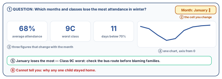
- A dashboard answers one question on one screen, for someone with no time.
- Its parts: the question · two or three figures · one chart · one interpretation · what it cannot tell you.
- Interactive means the reader changes one cell and the figures respond —
AVERAGEIF,COUNTIFS,SUMIF. - Typed-in numbers aren't a dashboard. They're a picture of an answer, wrong by next week.
- Everything must earn its place, and honest limits build trust faster than extra charts.
🕌 From our heritage
In tenth-century Aleppo a craftswoman known as al-ʿIjliyya made astrolabes for the court of Sayf al-Dawla. She learned the craft from her father, al-ʿIjlī al-Asṭurlābī, and both had trained under the Baghdad instrument-maker Nasṭūlus. An astrolabe was the original one-screen answer: a single brass face from which you could read the time, the direction of prayer, the height of the sun and the position of the stars — no scrolling through four hundred rows. Our only record of her is a line in Ibn al-Nadīm's Fihrist; the first name "Mariam", often given in modern writing, is not in that source.
Source: Ibn al-Nadīm, al-Fihrist (10th century). The asteroid 7060 Al-'Ijliya is named after her.
Debate it
Your dashboard shows January attendance at 68%. A parent sees it and says the school is failing.
Whose fault does a dashboard make something look like? What would you add to yours so it informs that parent instead of alarming them — without hiding the 68%?
Check yourself — practice, not a test
1. Put the four parts of a dashboard in the order they are built:
- 1. Interpretation, and what it cannot tell you
- 2. One chart
- 3. Summary figures that answer it
- 4. The question, written in words
2. What makes a dashboard interactive?
- ○ It has bright colours
- ○ It has more than three charts
- ○ The reader changes an input and the figures recalculate
- ○ It is printed on both sides
3. A dashboard should show everything you found, so the reader can decide what matters.
- ○ True
- ○ False
4. =AVERAGEIF needs three things: the range to test, the ______ to test it against, and the range to average.
5. Your figures do not change when the month cell changes. Most likely:
- ○ The laptop is slow
- ○ The figures were typed in rather than calculated from the cell
- ○ The chart is the wrong type
- ○ The file needs renaming
Remember
One screen, one question, and the honest line about what it cannot tell you.